Wednesday, June 20, 2018

Letter to Santa


It is time for the new challenge at Frilly and Funkie.  Zoe is our hostess this time and she is calling it By Airmail.  She describes it this way:

I just love sending and receiving letters in the mail. And especially love the stamps, airmail stickers and postmarks that these letters pick up along the way. For this challenge, create a vintage or shabby chic postal themed project. Think old fashioned aircraft, airmail stamps, post marks, postage stamps.

I rolled this one around in my brain for a while before deciding to make a Christmas card and focus on the tradition of sending a letter to Santa.  Since it is to be mailed I also made it fairly simple so it would be flat enough to not require more postage than normal - Canadian postal rates are excessive as it is.

I started to make a 5 1/2" square card and then thought it might be fun to change it up a bit by trimming half an inch off the right side of the front. Here is how I put it together:

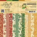
  • Cut a panel of St. Nicholas green patterned paper (Graphic 45), distress the edges and then ink with Vintage Photo Distress Ink.
  • Adhere to the right inside of the card and add computer generated sentiment.
  • Cut a panel of St. Nicholas gold patterned paper (Graphic 45), distress the edges and then ink with Vintage Photo DI and adhere to the inside left of the card.
  • Fold red card stock to create a two-pocket holder for Post Cards (Graphic 45 and Vectorstock).
  • Add some green patterned paper (Graphic 45) to bottom pocket and top with a postage stamp (Graphic 45) and adhere pocket panel to inside left of the card.
  • Cut a panel of St. Nicholas red stripe patterned paper (Graphic 45), distress the edges and then ink with Vintage Photo DI and adhere to front of the card.
  • Mat the vintage image (online find) on some green patterned paper (Graphic 45).
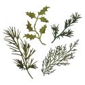
  • Cut greenery with Kraft Core card stock (Tim Holtz) and add to left of image.
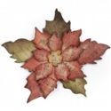
  • Die cut poinsettia from cream card stock, shape and layer petals and add microbeads to centre before adding to card.
  • Print postage icons (Vectorstock), ink edges with Vintage Photo DI and add top card.
I apologize for the lack of credit for the focal image.  I usually save them to a folder with the name that I need to attribute it too but this time for some reason, I just parked the image on my desktop.

I am loving the fact that I have a start on my Christmas card making.  Now to get on to the 25 or 30 more that I need to make before December - wonder if I will make it!

Thursday, June 7, 2018

Altered Book Cover


Today is the start of the June challenge at Stamps and Stencils and Lula, our hostess calls the challenge Do Judge A Book By Its Cover!  Here is how she describes the challenge:

Reading books has been my favourite activity ever since. I am also addicted to altering ordinary items surrounding us. For this challenge I I'd like you to alter any book cover. Creating altered cover is something anyone can do because your only limitation is your own imagination. You can use any type of books from children's books or user manuals to art journals. Don't forget to use stamping or stenciling and join us in the fun!

I was happy when I saw this challenge because I knew it would give me an opportunity to transform something I had at home into an art journal.


I went to my craft book library and selected this book to transform.  I bought it when it first came out in 1972 with the intention of teaching myself how to recover a chair.  I read it and realized that it was something that required classes if I was ever going to be successful and there was no time for that so it has been sitting on the shelf ever since.  Good thing it was only $2.50.


I started altering the cover by giving it a coat of white Gesso (Liquitex) and then using a small brayer, I added Smoked Paprika, Candy Floss and Zesty Zing Fresco Finish paint (Paper Artsy).

Next I added some stenciling with a Harlequin stencil (TCW) and Translucent Embossing Paste (Wendy Vecchi) but it did not show up the way I hoped so stay tuned for a later photo that will show you how I fixed that.  You can see a bit on the bottom of the following photo but only because the light hit it.


I added a whole bunch of bits and pieces - lace, metal, wood, buttons, etc. using Soft Gel Medium (Golden).  Then I covered all my bits and pieces with more white Gesso.


After the Gesso was dry I sprayed the cover with Bubblegum Pink, Lemon Zest and Squeezed Orange ink sprays (Dylusions).


Next I added some stamping with Watering Can Archival Ink (Wendy Vecchi) and stamps from Faded Fragments (Seth Apter) and a mixed set THMM101 (Tim Holtz).


Here is a photo of the embossing paste and stencil I used but make the stenciling more visible I lid the stencil back down and using a sponge and some white Gesso, I pounced some colour on.  Because I had to work around the bits and pieces, I missed a few spots but all in all it still looks much better.

So there is my new art journal ready for creating inside.  I hope you will find a book and alter it to create something new and fun.  If you do, please join us for the challenge - it runs until July 4th at 20:00 UK Time.

Wednesday, June 6, 2018

Adore


Today is the start of the new challenge at Frilly and Funkie.  Sara Emily is the hostess and is calling it Letter Perfect but read what she has to say about it because it isn't quite what you might expect.

According to Merriam Webster, 'letter perfect' is defined as "correct to the smallest detail". We're not asking you to be immaculate or flawless; we just want to see letters or words on your vintage or shabby chic project. They don't have to be the focus, but be sure we can see them!

I recently got a new Prima paper pad called Love Story and thought I would use it to make this card.  Here is how it came together:

1.  Cut a 6"x12" piece of xx and fold it in half to make the card blank.
2.  Cut a large piece for the background, distress it and ink it with Frayed Burlap Distress Ink.
3.  Die cut a square doily from the Kraft Core, ink the edges and add it on the right of the card.
4.  Cut a smaller panel from the Love Story pad, distress and ink it and add it on the left.
5.  Add a strip of venise lace to the smaller panel.
6.  Fussy cut some ephemera from the Love Story pad, distress and ink them before adhering them on top of the smaller panel.


7.  Use three colours of Kraft Core and the Shabby Posies die to cut two petals of each.
8.  Ink the edges, shape the petals and layer them.
9.  Add large seed beads to the centres with Glossy Accents.
10.  Use the Garden Greens die to cut some branches from the Kraft Core and add them to the card.
11.  Make a loopy bow from burlap string and tuck it beside the flowers.


12.  Add embossing paste through a Flourish stencil to a chipboard heart.
13.  Cover the heart with a coat of White Gesso.
14.  Paint the heart with Tattered Rose Distress Paint.
15.  Rub White Gold Metallic wax paste over the raised flourish design and adhere the heart to the card.
16.  Ink the word Adore (made from mat board) with Frayed Burlap DI and add it to the heart.

I hope you will join us for this fun challenge.  One randomly chosen winner from the entries will receive a gift certificate to go shopping at The Funkie Junkie Boutique and the Design Team will choose their top picks with the overall top pick getting an opportunity to guest design with the team.

The following products used to create this card came from The Funkie Junkie Boutique - a great place to shop with the best customer service:

Thursday, May 31, 2018

Inspiration Post at Stamps and Stencils


Here is a sneak peek at something I have made for my Inspiration Post over at Stamps and Stencils.  Check it out by clicking HERE.

Wednesday, May 23, 2018

Lace Journal Cover


It is time for the new challenge at Frilly and Funkie and Autumn, who is our hostess is calling it Layers of Lace.

Lace, oh so lovely lace! Whether you add delicate layers of fine lace, or tattered and torn crocheted lace, we'd love to see you add dimension and depth to your vintage or shabby chic project with lace. Perhaps you have a favorite lace stamp or will choose to lace something up, we'd love to see your creations inspired by this topic.

I was walking around the dollar store a couple weeks ago and found an inexpensive journal - nothing is ever a dollar anymore so I hesitate to call it cheap.  It is in a 5 1/2" x 8 1/2" format and I immediately knew I could make a removable cover for it with lots of lace.


I knew I wanted a sturdy fabric for the actual cover and found some canvas that I had picked up at the local art supply store in my sewing cupboard.  It tears both ways so I tore a piece 4 1/4" wider than my journal when it was opened fully and 3/4" taller.  Then I folded each side in 2" and used gel medium to glue the folded parts down at the top and bottom making sure to stay within 1/4" of the outside edges.  Now I have pockets for the journal cover to slide into and when the journal is full, I can easily replace it with a new one.


I wasn't sure if it would stay closed once it was done so I decided to add some seam binding across the centre of the outside so I would have something to tie it closed.


The next step was to add all the lace to the outside.  I knew I didn't want all white on this cover so I started with some cream laces on the top and bottom that came from my stash and then I added a wide strip of  very fine lace across the middle that came from my late Mother-in-Law's sewing stash.  I had to take it apart because she had started to sew it together in a v-shape perhaps to add to the neckline of a blouse since she made all her own clothes and did so without a pattern.  Then I added strips of different white laces, all of which came from The Funkie Junkie Boutique.


Then it was time to embellish the front cover.  I did not add embellishments to the back cover so that it would lie flat on the desk.  The first thing I did was print a vintage image of Lily Elise on the computer and die cut it with a die called Fleur de Lis Squares (Spellbinders).  I inked the edges with Spun Sugar and Vintage Photo Distress Ink (Tim Holtz) and then added it to the cover with dimensional foam.


Another flower was made from card stock.  I die cut a couple of petals from the Shabby Posies die (Tammy Tutterow) and inked it with Spun Sugar and Vintage Photo DI.  Then I shaped it and glued the two petals together with a button for the centre.  I also painted a wee bit of white Gesso on the petals.  When I added it to the cover, I tucked a couple of loops of pearl string underneath.


Next I created a flower from pleated ribbon by gluing it in concentric circles with my glue gun onto a card stock circle.  I found a resin flower in my stash that was perfect for the centre and added it with some dimensional foam.


I always hang on to the tiniest bits of lace so to make this lace flower I just gathered a little strip of lace with a running stitch and glued it to a card stock circle.  Then I snipped the edges away from three pieces of another lace pattern and glued them into the centre.  I added a pearl embellishment to the centre.


I added a bit of crochet ribbon topped with a lace applique and a flower from my stash that was already a nice shade of pink and I just painted it with a wee bit of white Gesso before I dded a button centre.


Under the focal image are a couple more flowers from my stash that were ivory and I inked them with some of the Spun Sugar and Vintge Photo DI before I added the Gesso and buttons.  I also cut a white fabric daisy in half and tucked it under the image.  I made a loopy bow from white twine and tucked that under the ribbon flower.

The crochet flower came from my Mother-in Law's stash and I added a pearl brad for the centre.  Under that I added a strip of burlap and more buttons.

This was a very easy project to make and I think it is very romantic.  I hope you will share a lace project with us.  One randomly chosen winner will receive a gift certificate to go shopping at The Funkie Junkie Boutique - FUN!!  The Design Team will choose their top picks and the overall top pick will have the opportunity to Guest design with us.

Wednesday, May 9, 2018

Surf's Up


The new challenge starts today at Frilly and Funkie.  Kathy is our hostess and calls it Surf's Up.  She describes it this way:

Who's ready for a little sand, a little sun, a little surf? Let's take a little stroll beside the shore and create a vintage or shabby chic project with a beachy theme. Use ocean colors or beach images to add a fun seaside feel to your project.

When I started to think about what I was going to make for this challenge, I had lots of great ideas running around in my brain and then fate stepped in and changed the course of my creating when I stood up from my desk and heard the worst crunching sound from my knee and I almost landed on the floor.  I have spent a lot of time playing couch potato with my leg elevated and an ice pack on my knee.  Unfortunately this has prevented me from spending much time at my desk so I had to come up with a plan I could execute in short bursts and it also meant no process photos along the way.  I am improving and I am really, really bored although I have managed to read a few books and get caught up on some TV so I guess it isn't all bad.

Anyway, back to my card.  I started with some white card stock (Staples) for the blank and then added a distressed panel of patterned paper from a pad called Voyage Beneath the Sea (Graphic 45) that was inked with Frayed Burlap Distress Ink (Tim Holtz).

Next I cut a panel of white corrugated cardboard (The Funkie Junkie Boutique) and inked it with some Abandoned Coral Distress Ink (Tim Holtz).

Two tags came next.  The first one is cut from a pad called St. Tropez (Prima) and the other one is cut from the fabric paper that I made for my Saturday Showcase that you can find HERE.  Both tags are topped with some burlap ribbon that I split in half lengthwise so it would be a little more frayed.

When I thought about how to embellish my card, I decided to add beach-themed icons.  First, I tied a little net from some twine and added it to the fabric paper tag.  Then I found some word art on my computer that I created a few years ago so I printed that, distressed the edges and inked it with Antique Linen Distress Oxide (Tim Holtz).

The sunglasses is actually a button that I altered by cutting the shank off and then inking the frame with Terracotta Alcohol Ink (Tim Holtz) and then rubbing with some Rich Copper Wax Paste (Prima).

The starfish is made from Crafter's Clay (Martha Stewart) and a silicone mould (Wilton) and then it was coloured with Rusty Hinge Distress Ink (Tim Holtz) and a bit of Terracotta Alcohol Ink.  I used a White Pen (Stigno) to highlight the bumps on the starfish.

The flip flops are clip art that I coloured with Antique Linen and Frayed Burlap Distress Oxide (Tim Holtz) using a water pen.  The umbrella is also clip art that I coloured with pencil crayons (Prismacolors) blended with OMS (Gotrick) and added a wooden skewer for the

I used the Shabby Posies die (Tammy Tutterow) to cut the "Hibiscus" from a scrap of card stock and then coloured it with Abandoned Coral and Picked Raspberry Distress Oxides (Tim Holtz) before I added the stamens, which were also coloured with Picked Raspberry DO.  If you are wondering why this flower, well I Googled "Flowers at the Beach" and this is what came up so I went with it - Google is such a great resource.  Finally, I added a miniature shell that I found in my shell.

Given my current physical state, I think sitting on a lounge chair at the beach would be more fun than hanging out on my couch and thinking about all the tasks/chores I should be doing.

Thursday, May 3, 2018

Faking It


It is time for the next challenge at Stamps and Stencils.  Toni is our hostess for this one and she calls it Let's Fake It!  Here is what she has to say about it:

I love faux finishes of all descriptions whether it be rust, stone, leather or time worn vintage. You name it we have the power to fake it! I'd like to see your projects that include at least one faux finish. Produce anything you like but please include some stamping or stenciling or both if your heart desires!

I decided to make a steampunk inspired canvas with lots of faux rust.


I started with a 7" x 9" stretched canvas that I picked up at the dollar store and covered it with torn strips of old book paper that I glued on with Mod Podge to give it some strength.  Next I used some Molding Paste (Golden) through a stencil called Measured (Tim Holtz) to add some texture.  The whole canvas was given a coat of white Gesso (Liquitex) before it was given some colour.


The canvas was painted with Honey Brown Acrylic Paint (DecoArt) and then a coat of Mocha Mousse Chalk Acrylic (Paper Artsy), which was randomly wiped back with a baby wipe while it was still wet.


To give the canvas some life I used a sponge to add a variety of acrylic paints - Espresso (Craftsmart), Pure Black (Folk Art), Rich Espresso and Worn Penny Metallic (Deco Art) and then I added spray inks - Moonshadow Mist Burnished Brass (Lindys) and Gathered Twigs Distress Spray Stain (Tim Holtz).


Using some Jet Black Archival Ink (Ranger) I some markings with stamps - Border Lines (Seth Apter), Limor's Circles and Tasty Textures (IndigoBlu).


I made a background panel next by adding paper backed adhesive metal foil tape (Cantech) to a piece of light chipboard and then ran it through a Blueprint Texture Fade (Tim Holtz).  Before I cut it down to size I used an embossing stylus to add more markings.


The next step was to paint it completely with Pure Black Acrylic Paint (Folk Art) and then wipe off the paint from the raised areas.


The metal panel was given a rusty tone by covering it with alcohol inks - Rust, Terra Cotta, Pitch Black and Copper Mixative (Tim Holtz).  Some blending solution was added on the felt applicator to make the colours flow and blend more easily.


I stamped the focal image from a set called Steampunkesque (IndigoBlu) onto a scrap of white card stock using Jet Black Archival Ink (Ranger).


The image was inked all over with Vintage Photo Distress Ink (Tim Holtz) and then coated with Clear Rock Candy Distress Crackle Paint.


My husband cut some wooden gears for me on the laser cutter and to turn them into grungy rusted gears I first coated them with a mixture of Regular Matte Gel (Golden) mixed with some sand (borrowed from the playground).


Next the gears were painted with Payenes Grey Fuid Acrylic (DecoArt Media).  After this was dry I sponged on bits of Quinacridone Gold Fluid Acrylic (DecoArt Media) and Worn Penny Metallic Arcylic (DecoArt) and ojnce I was happy with the combination, I coated them with Ultra Matte Varnish (DecoArt Media).  The photo I took of this step was so blurry that no amount of edit would make it visible - my apologies.


I collected a bunch of other metal bits and pieces (Tim Holtz and My Husband's Workshop) to add to the canvas and altered them with a combination of Rust, Espresso and Copper Mixative Alcohol Ink (Tim Holtz).

To assemble the canvas I used some Soft Matte Gel (Golden) to attach the metal panel first, followed by the focal image and then the gears and bits and pieces adding a couple of buttons and a funky bead  from my stash to round out the embellishments.

I hope you will create something faux and join us for this challenge.