Wednesday, September 27, 2017

Lovely Lady


It is time for the new challenge at Frilly and Funkie.  This time Autumn is the hostess and is calling it Show Us Your Stamps.  She describes the challenge this way:

Our challenge this round can be summed up with one word - STAMPS! We want to see you break out those stamps and get inky. There are so many ways to use stamps, and you probably have a few you have never even used - so come play along! We cannot wait to see your stamped vintage or shabby chic creations.

I have made a shabby card with a lovely vintage image - a card that would be perfect for Mother's Day or perhaps for the birthday of a lady in your life.

Using paper from the Wild and Free pad (Prima) I cut a couple of tags.  I used a small hole punch (EK Success) to create the holes and added a reinforcement (Avery) that was inked with Black Soot Distress Ink (Tim Holtz).  The tags were distressed and some burlap string was added through the holes.


To make the frame I used some black card stock (Recollections) and a die from Petite Ovals Large and a die Petite Scalloped Ovals Large (Spellbinders) together.  The image was printed on the computer and hand cut to shape before it was mounted on the back of the frame.


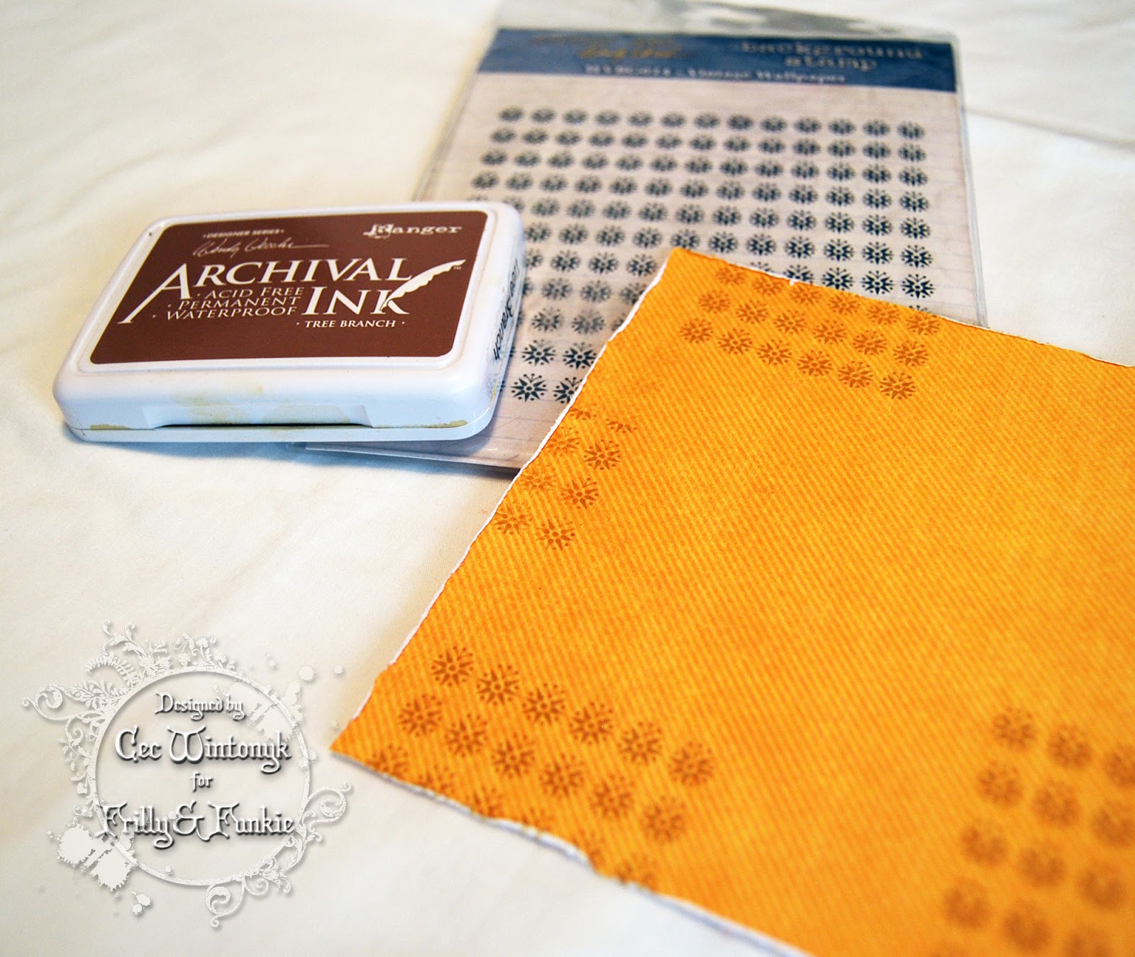
The flowers were stamped onto scraps of card stock using the rose from a set called Flower Garden (Tim Holtz) and Jet Black Archival Ink (Ranger) and then fussy cut.  Shading was added using pencil crayons (Prismacolors) blended with OMS (Gotrick) - nectar for the two light flowers and Black Cherry for the darker one.


The leaves were made with scraps of gray card stock cut with a Garden Greens die (Tim Holtz).  They were shaped and inked with Black Soot Distress Ink (Tim Holtz).

Finally, I added some black gem flourishes (Recollections) to the light tag, some pink pearl flourishes (Dollarama) to the dark tag and then tucked a feather under the frame.

The following products used to create this card came from The Funkie Junkie Boutique:

Saturday, September 23, 2017

What the world needs now...


This is my project for the Grand Final of ITAC'17 - The World.  The sub text for this challenge is United We Stand, Together We Connect so I used that as my inspiration.  There is another list of elements of which at least one must be incorporated in the project.  I used circles, the colour white and most of the words listed.

I took a couple days off this week to celebrate my husband's birthday and our 42nd wedding anniversary so I am running behind, which means no process photos but I will describe what I did and give you some close-ups..

I covered a 12"x12" flat canvas panel (Artist's Loft) with crumpled up tissue paper using Mod Podge.  This is my go to technique for adding a bit of texture when I know I am not going to use stencils and texture paste.


I covered the canvas with some Silver Gray Acrylic Paint (Deco Art) and then used a sponge to add Dove Gray Acrylic Paint (Folk Art).  Then I sponged on some Dark Scarlet Acrylic Paint (DecoArt), some White Gesso (Liquitex) followed by the two gray paints.


Next I prepared my focal point.  My husband cut the people silhouettes from chipboard (Bazzill) and I coated them with Black Raven Metallic Paint (IndigoBlu).  This paint doesn't dry really black but is more of a gun-metal colour with shimmer.  I drew the hearts on the computer and fussy cut them before adding some texture to them with Crackle Paste (Golden) and then Dark Scarlet Acrylic Paint (DecoArt).  A little aside:  I have a jar of of Golden Crackle Paste that has dried out in only a few months despite being perfectly sealed and stored in a plastic bin with a lid.  I don't want to throw $13.00 plus tax away so I am adding a touch of water to it and using it like texture paste now.

I found the globe circles on the internet, scaled them down, printed them and fussy cut them.


I created the sentiment in Photoshop inspired by one I saw online that had no credit.  Once it was printed and cut I decided to give it some subtle cracking (much like our world is cracking apart these days) by adding some Translucent Embossing Paste (Wendy Vecchi) through a crackle stencil (Prima) - a little difficult to see in the photo but it is there.

The people were adhered using Super Thick Slap it On (IndigoBlu), the globes were adhered with Double Sided Tape (Scor Tape) and I used Dimensional Foam to add the hearts and the sentiment.

I added lots of markings using Jet Black Archival Ink (Ranger) and stamps from a variety of sets - Ultimate Grunge, THMM101 (Tim Holtz) and Large Collage (Wendy Vecchi).  Finally I used the cap from a water bottle with some White Gesso (Liquitex) and Stormy Gray Acrylic Paint (DecoArt) to make some circles.

Now if only the leaders of the world would set an example for the citizens of the world to unite the way my little people have.  We are only on this planet for a brief time, so let's make it a happy time.

Thank you to the organizers, artists and judges of ITAC'17 for such a fun tournament.  I was really challenged both by the topics and the time frames but I stuck with it and had a great time.


Friday, September 22, 2017

Before the Storm


I decided I would make a second project to enter in ITAC'17 Challenge 5 - The Americas since my first piece was rather sombre so I started it over a week ago.  I remembered that on a few of our cruises in the Caribbean, many of the islands had an abundance of Bougainvillea.  This gorgeous perennial grows wherever it is hot so you can find it in South America, the Caribbean and the southern states in the US.

I found a photo online of a door in the Dominican Republic that had Bougainvillea growing over the top and thought I would make a happy coloured layout with the image as my focal point.  Little did I know when I started this project that Hurricane Irma and Hurricane Maria would plow through some of these islands ripping them to shreds and leaving so much in ruin, which is why I am calling this Before the Storm.

I have only used some of the elements in the list this time - specifically shades of green and metal.


I started with a 12"x12" flat canvas panel (Artist's Loft) and added some stenciling with Molding Paste (Golden) through a Checkmate stencil (Wendy Vecchi).


I added all sorts of bits and pieces using Super Thick Slap it On (IndigoBlu) and Mod Podge.  The pieces are as follows:

Lace, Buttons (My Stash)
Metal Leaf (The Funkie Junkie Boutique
Metal Medallion (Bead Landing)
Roses (Wild Orchid Crafts)
Wooden shapes and Butterfly (My Husband)
Spiral Clips (Making Memories)


Next I covered everything with a couple coats of White Gesso (Liquitex) to unify the colour.  I brushed on some Bayberry Acrylic Paint (Folk Art) and then used a sponge to add some Lt. Avocado Acrylic Paint (DecoArt).   I followed that with Shabby Shutters and Peeled Paint Distress Spray Stain (Tim Holtz).

Finally, I distressed the edges of the image and added it with some dimensional foam strips and then I dripped a little Cherry Pie Spray Ink (Dylusions) randomly over the painted section of the canvas.

There you have my second project.  With lots of help, I am sure the affected islands will recover and the Bougainvillea will flourish once more.

Wednesday, September 13, 2017

Fall Scarecrow


It is time for the next challenge at Frilly and Funkie.  Kathy is our hostess this time and she calls it To Everything There is a Season.  Here is what she has to say about it:

Fall is one of the most beautiful seasons of the year. Brilliant leaves, fall flowers, crisp blue skies, and migrating geese fill the season with a sense of wonder and anticipation You're invited to create a vintage or shabby chic project that captures the beauty of fall. You can make a card, a tag, share a journal entry or any kind of project you desire. Just be sure to create it in the shabby chic or vintage style and be sure to use fall (not Halloween) images and colors.

I have made a card with a very vintage image of a scarecrow out in the field with his warm clothing on.


I started with some Bazzill card stock for the blank.  Then I cut a panel of paper from Graphic 45 Voyage to the Bottom of the Sea for my background.  I stamped it with the Vintage Wallpaper stamp (Wendy Vecchi) using her Tree Branch Archival Ink.  I distressed the edges and inked them with some Gather Twigs Distress Ink (Tim Holtz for Ranger).

Next I cut a tag shape from some paper from Graphic 45 Time to Flourish, distressed and inked it and then added it to a larger tag of brown card stock (Recollections).  The hole was punched with an EK Success punch and then I added a reinforcement (Avery) that I inked with Gathered Twigs DI.

Some seam binding was dyed with Wild Honey DI and added to the top of the tag.

I cut the text from the bottom of the vintage image to use as a separate sentiment although it is really dark so you have to bring up a larger version of the photo to read it.  The image was distressed, inked and mounted on some brown card stock.


Next I die cut all the leaves and branches from the Fall Foliage die set (Tim Holtz for Sizzix) using a variety of colours from the Kraft Core Shattered Collection (Tim Holtz).  Each piece was inked on the edges and veins with Gathered Twigs DI and shaped a bit from the back with a large embossing tool.


The sunflower image was a digital freebie I got a few years ago from Beccy's Place.  I printed it three times on a scrap of white card stock and then cut two of them apart so that when I layered them, the flower had a dimensional look.  The flowers were coloured with  pencil crayons (Prismacolor) and blended with OMS (Gotrick).

I added some black microbeads to the centre of the top flower before I layered them together and then tucked a loopy bow made from burlap string under the sunflower when I added it to the card.

Tuesday, September 12, 2017

Climate Change

The fifth challenge for ITAC'17 is The Americas.  As with the other challenges there is a list of elements, at least one of which must be included (I used two this time - the green paints and something sharp) and this time there is also a mood board.

The judges have created their usual awesome inspiration but something struck me right off the bat - the mood board photos and the description of the inspiration pieces focus mainly on The United States and South America.  Certainly these are areas in The Americas but there are so many countries - 55 located in South, Central and North America as well as the Caribbean.  I live in Canada and we are the 6th largest country by population and the largest by area so naturally I wanted my project to focus on Canada.


I decided to make a statement piece.  Canada has a vast area of the north that is cold and usually covered in ice and snow.  Lately however, the changes in our climate have made sections of the ice break apart and there are larger areas of open water in the southern parts of the north.  This is devastating for the polar bear population and is causing a decrease in the number of animals in the wild as the migration gets more perilous for them.  My canvas shows a Mother and her two Cubs on one of the ice floes and I can only imagine them wondering how far it is to the next one is.

So now I had a concept but how to execute it, which proved more difficult than I thought.  As you will see, I changed direction part way through and in the end I wish I could have come up with a jazzier submission but despite its simplicity, it does say what I want it to.


I started with a 9"x12" canvas (Dollarama) and gave it a coat of White Gesso (Liquitex).  I crumpled up some tissue (Dollarama) and adhered it to the canvas using Mod Podge.


Next I painted it with three shades of green paint - Mint Julep (DecoArt), Village Green and Forest Green (Accent).


I was intending for this to be nothing but open water and very foreboding so I spritzed it with some Iced Spruce and Hickory Smoke Distress Spray Stain (Tim Holtz for Ranger).

I covered it with plastic wrap to show the shine of the water and then I added some sections of texture paste to replicate ice floes.  This is where things changed so there is no photo.  I hated the result so quickly scraped off as much texture paste as I could save and then peeled off the plastic wrap and tossed it in the garbage.  Thankfully it did not peel the paint off.


I painted over the top portion of the canvas with some Light Blue Acrylic Paint (Folk Art) and sprayed it with the Distress Spray Stains, adding some Tumbled Glass as well.  Then my water looked way too green so I covered it with some watered down Slate Blue (Folk Art).


Next I added some scraps of wood that I rescued from the garbage in my husband's workshop and glued it on with Super Thick Slap it On (IndigoBlu) to make a base for my ice floe.  I fussy cut the bears from an image I found online and then covered the floe with Light Molding Paste (Golden and added mirror chips (Michaels).

Finally, I sponged some white paint on to make a few clouds and then added some flying gulls with tracing paper and coloured them with a grey pencil crayon (Prismacolor).

To see all the other takes on The Americas, click HERE.

Saturday, September 9, 2017

Brave, Strong, Proud


The 4th challenge for ITAC'17 is Africa and I have made this canvas for my project.  From the list of elements that I had to choose at least one from, I managed all of them.

Warm, bright colors
Repeated ethnic patterns
Charms, pearls, metallic wire…
Words or text
Textures, cracks, rust effect...


I started with a 9"x12" flat canvas (Dollarama), covered it with a coat of White Gesso (Liquitex) and then a layer of crumpled up tissue.  Next I added Haystack Fresco Finish paint (Paper Artsy).  Once that was dry I built up layers of colour around the edge (the middle is going to be covered) with a dry brush.  I used Pumpkin Soup, Smoked Paprika and Blood Orange Fresco Finish (Paper Artsy) and Dark Scarlet Acrylic Paint (DecoArt).  I also used a little wad of paper toweling to add a bit of Deep Violet Acrylic Ink (Liquitex).  Finally I added more Haystack Fresco Finish in spots.


Although it is difficult to see, I added some extra colour with spray inks - Mustard Seed Distress Spray Stain (Tim Holtz for Rager) and Olive Copper Starburst (Lindys).


I added some repetive markings around the border with a Mini Pattern Strips stencil (TCW) and Gathered Twigs Distress Ink (Tim Holtz for Ranger).  Once the canvas was assembled I realized it was way too light so you will notice on the final canvas that I went over it with some Jet Black Archival Ink (Ranger).


Next I created my centre panel.  I tore a piece of card stock and covered it with Wild Honey, Dries Marigold, Rusty Hinge and Crushed Olive Distress Ink (Tim Holtz for Ranger).  Then it was time for my lady to be added.  I had drawn her by hand on a scrap piece of paper on my desk and she looked exactly the way I pictured her so rather than taking a chance and trying to redraw her on my background, I traced her head, arms and legs using carbon paper.  I traced the dress, collar and basket on scraps of card stock since they were going to be covered.


I used a Dark Umber pencil crayon (Prismacolor) to colour her.  Then I decided the background was too plain so I made a mask of her and added some inks - Olive Copper Starburst (Lindys) and Birdwing Copper Pearlescent Acrylic Ink (Daler Rowney).


Now it was time to dress her.  Her dress is made from some batik fabric (Ultimate Sewing Centre), her basket is covered in burlap (my stsh) and the collar has rows of large seed beads (Michaels).

To assemble the canvas, I tore a piece of kraft card stock (Recollections) and inked the edges with Gathered Twigs DI before I adhered it to the canvas.  I mounted the image panel on top of the kraft panel.

Next I made some text on my computer, distressed the edges and inked them with Gathered Twigs DI.  A bronze bead was added to ach word.

I made a chain of charms (Bead Landing) and beads on a length of copper wire (my husband's work shop) and added that to the canvas.

I am off to enter my project along with all the other wonderful projects HERE.


Thursday, September 7, 2017

Metallics for Stamps and Stencils


It is the start of a new challenge at Stamps and Stencils and this time, our hostess Rachel is calling it Metallics.  She describes the challenge this way:

This month I would like you to make a piece involving metallics in some way - it could be metallic paints, rusted metal techniques, actual bits of metal, metal foil ....the possibilities are endless - also please use stamps and/or stencils. Have fun!

I decided to make a wall hanging for my inspiration.


I started my wall hanging by cutting 3 pieces of chipboard (my stash) into 4" x 4" squares and drilled some holes in them.  Two of the squares have holes in all four corners and the third one has holes in the top two corners as it will be the bottom panel of the hanging.

I glued a square of burlap (my stash) to one of the panels with four holes.


I added some stenciling on the other two panels using Molding Paste (Golden) through Harlequin and Bubble stencils (Tim Holtz).

All three panels were given a coat of White Gesso (Liquitex).


I painted the panels with some Lake Wanaka Fresco Finish Paint (Paper Artsy).


Next I added some spray inks to the panels - Tarnished Brass, Tumbles Glass and Chipped Sapphire Distress Spray Stain (Tim Holtz) as well as Olive Copper Starburst and Buccaneer Blue Moon Shadow Mist (Lindy's).


I thought the panels could use a little more metallics so I sponged on some Copper and Sun-up Blue Pearlescent Acrylic Ink (FW - Daler Rowney).

I added some randon stamping using a script stamp (Recollections) and Jet Black Archival Ink (Ranger).


To embellish my panels I started by hand cutting cutting some chipboard hearts.


Using an embossing folder (Tim Holtz) I embossed some paper backed metal foil tape.  The tape was then adhered to each heart piece and the excess trimmed away.


The hearts were given a coat of Coffee Bean Acrylic Paint (DecoArt) and some of the paint on the raised surfaces was wiped off using a baby wipe.


Next I pounced on a mixture of Poppyfield, Gold Mixative and Copper Mixative Alcohol Ink and Blending Solution (Tim Holtz for Ranger).

I used the same alcohol ink combination to alter some buttons (Fancy Gap, Gears and a Medallion (Bead Landing).


A metal key, clock and arrow were altered by pouncing on some Pitch Black Alcohol Ink.

To assemble the hanging I mounted a heart on each panel and then added the copper metal bits next to the hearts on two panels.  The black metal pieces were added to each heart.

Finally some black cord (Dollarama) was used to tie each panel together and the top panel to a piece of branch that fell from a tree in my back yard.

I hope I have inspired you to join us for this Metallics challenge.

Monday, September 4, 2017

The Chief


Say hello to a Maori Chief.  I have created a collage in mostly earth tones around this chief as my offering for the third challenge for ITAC'17, which is called Oceania.

As with the first two challenges, there is a list of elements to consider but not everything on the list must appear in your project however, at least one must.  I think I have everything covered.

  • Patterns inspired by traditional symbols (Maori tattoos, Dots/dashes of aboriginal Arts…) 
  • Think Monochromatic black and white or think colors of the Earth
  • Some sort of organic or natural material(s) (earth, stone, bone, bark, wood, fibres…) 
  • Shapes inspired by traditional or indigenous art

I started with a 9" x 12" flat canvas from the dollar store and added dots in the form of texture using a Tiny Circles Stencil (TCW) and some Light Molding Paste (Golden).  I also coated it with some White Gesso (Liquitex).


I started adding colour to the canvas with a layer of Khaki Acrylic Paint (Craftsmart) followed by a layer of Mocha Fresco Finish (Paper Artsy) that was wiped back in spots using a baby wipe.


A little more stenciling followed with Jet Black Archival Ink (Ranger) and Mini Pattern Stripes stencil (TCW).


To finish the canvas colour I added some Gathered Twigs Distress Spray Stain (Tim Holtz for Ranger).

The next step was to assemble my collage items.  I am sorry there are no individual process photos but I will describe all the pieces.

1. The image came from the New York Public Library Digital Collection and was inked with Gathered Twigs Distress Ink and then coated with Crazing Medium (both from Tim Holtz for Ranger)

2. The wood strip was peeled from some tape that I picked up at a floral warehouse in the UK.

3. A skeleton leaf that I coated with some Rich Espresso Metallic Paint (DecoArt)

4. A large oval wooden bead that I cut in half

5. Some fun fur (Fabricland) that started out as white but was dyed with some Soft Suede Reinker (StampinUp) and then topped with a strip of geometric tape (Fabricland)

6. A feather (Dollarama)

7. A piece of limestone (from my front step, which is breaking down after 15 years of weather and wear and tear but not going to waste)

8. A wooden toggle attached to some braided jute (my stash)

9. Maori symbols added to a piece of cork with some Light Molding Paste (Golden) and a stencil my husband made for me on the laser cutter using symbols found as a colouring page on the Christchurch Public Library web site

To assemble the collage, I attached everything with Super Thick Slap it On (IndigoBlu).

There you have my take on the theme Oceania.  I am off to enter it HERE and then I am going to think about the next challenge.  Having so much fun!!!

Friday, September 1, 2017

Friday Focus at Frilly and Funkie


I am presenting the Friday Focus segment at Frilly and Funkie this time and here is a little sneak peek.  To find out what I am focusing on and get all the details just pop on over to Frilly and Funkie.